


I have always had a passion for interior design. Since I was 3 years old I was remarking to my mother about details, colors, etc. She said she knew I had a gift when at age four I told her that the paper towels matched the kitchen perfectly.
All of my life I have been helping friends, family, neighbors, even acquaintances find great decor items, pick out color schemes, and decorate. I also took classes at school in interior design.
My main hobby is to find ways to create interior designs that look expensive for cheap. We don’t all have a limitless budget when it comes to renovating or decorating, so one of the best ways to save money is to do it yourself.
Although I believe in and highly support Interior Designers (one day I may aspire to be one)… I also know that many people don’t have it in their budget to hire a professional.
Understanding the color wheel, how it works, and choosing colors based on what compliments each other and avoiding colors that clash can save you a lot of time, headache, and money.
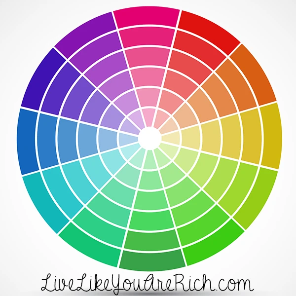
When picking a color scheme for a room, I almost always consult a color wheel like this one. You will usually get great results when you choose colors that are opposite from each other. These are otherwise known as Complementary Colors.

So what do I do?
First, I pick out my main color or colors. I typically limit it to one or two main colors.
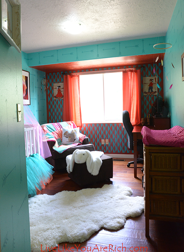
As you can see in my soon-to-be daughter’s nursery below I used turquoise and coral which are across from each other on the color wheel.

Then I pick neutral or base colors like grey, brown, or black. A lot of other people love either brown, black, or grey. A few love to decorate with any or all of them. I prefer brown and choose it the majority of the time for my own home.
I also pull in another base or neutral color such as off white, white, creme, tan, etc. to add another filler color without overwhelming the color palette.
Finally, after I have my basic color(s) and main color(s) picked out, I almost always add an accent color to add interest, depth, and dimension to the room.
I find that if accent colors are complementary colors themselves, or are close neighbors in the grouping on the color wheel they will work well together.
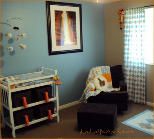
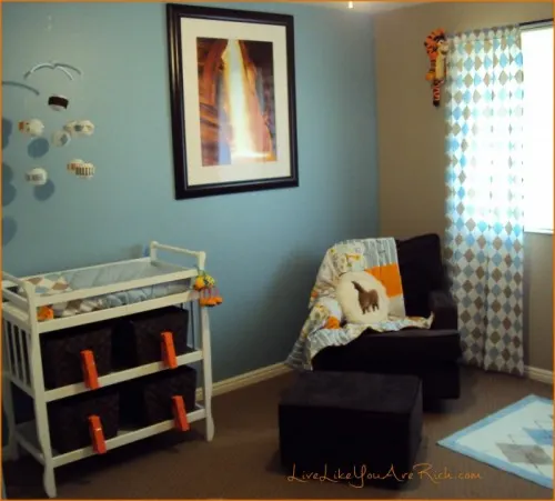
For my son’s nursery (see full nursery here) it was mainly brown, blue, and white with the accent color of bright orange. The accent color orange is a complimentary color of the light blue.
For my soon-to-be daughter’s nursery (see full nursery here) I used a hot pink. Which was a close neighbor to the coral.
For our master bedroom we went with brown, a deep aqua/green, and off white, with the accent color being purple. The accent purple is a complimentary of the aqua/green.
I’ve decorated many rooms with orange, brown, and tans as the basic and main colors with the accent color of yellow. Yellow is a close neighbor to the orange which worked really well.
Another great one I’ve decorated in is a hunter green color scheme with a cranberry accent. It is very complimentary and not too Christmas-y. Our cabin is decorated in this color scheme and I love it.
So the rule of thumb I have is that the accent color should either be a complimentary color or a close neighbor on the color wheel to one of the main colors being used.
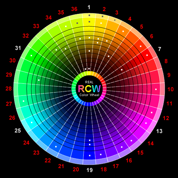
It may also be helpful to mention that most colors used to decorate interiors with are toned. This means they have both white and black (aka grey) mixed into them. The amount of grey mixed in determines the tone.
I prefer to match the tone of the most of the colors used in the same room. My son’s nursery had really similar light tones for the blue and brown. I did that on purpose. I wanted a more relaxing color scheme. The bright orange really popped out too because it was a different tone, which was also on purpose.
For the Navajo nursery I used colors that were very vibrant and were not toned very much. I added just a few pieces of a different tone (the squirrel pillow and the crib sheet) but everything else was very color-rich, which was also on purpose.

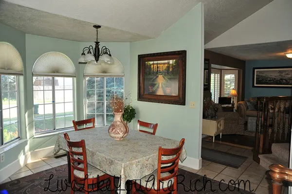
You’ll see in my dinning and living rooms (if you can see into the other room), that I matched the tones of the colors. This is because the rooms are open to each other and connected. I wanted different colors in each room. The living room is blue, brown, cream, and has a bronzey-orange accent and the dinning area is sage green, brown, creme, and an accented soft yellow. I didn’t match the all of the colors in both rooms but I did match most of the tones. Matching the tones helps the space flow better, look larger, and seem more connected.
After choosing your own color scheme and tones, to save even more money, I recommend taking the color you want with you the paint store and have them match the color if you can’t find a match in their samples.
Also, take an object along with you that has the color(s) and tone(s) you have chosen for your room when picking out decor, fabric, and other items. Doing this will help you get the right tone and color hues that you desire.
Let me know if you have any questions… and I hope this helps next time you want to choose a color scheme for a room.

For other ‘rich living’ and money saving tips please subscribe, like me on Facebook, and follow me on Pinterest.
James Bergman
Tuesday 10th of May 2016
Picking paint colors is my least favorite part about getting my house painted. You walk into the store and there are hundreds of color choices. I never know where to start. However, I do really appreciate your suggestion to use a color wheel. Once I have a color picked, this will help me figure out what other colors I could use.
Anita Fowler
Saturday 14th of May 2016
You're welcome James. Thanks for stopping by and leaving a comment. Color wheels help me a lot!
Carrie
Wednesday 18th of February 2015
This article was really helpful! I had remembered about the color wheel when I was googling color combinations, but I decided to go to Pinterest where I get my best ideas, and I found your article! I've got an open floor plan in my main living space: the living room, dining room, and kitchen, but between the living space and the dining, I've got my desk, so like an office area. My question is how can I paint and divide that long wall that connects all 3 spaces?
Anita Fowler
Wednesday 18th of February 2015
You could do a neutral color that ties all the rooms together and then on each individual space have an accent wall that divides the space up. You can also use furniture, rugs, and wall art to visually divide the room. I'd recommend googling large open concept multi-purpose rooms to get some ideas :). I however would not recommend painting the long wall three different colors. It will make it feel choppy and smaller. Best of luck!